- The Bench Brief
- Posts
- From animation to algorithms🎬📊: How innovation is reshaping storytelling
From animation to algorithms🎬📊: How innovation is reshaping storytelling
Inside the tools, techniques and transparency pushes shaping the next chapter of digital journalism
Storybench
November 21, 2025
Hello from the Bench!
This week, we’re spotlighting the fast-evolving tools and techniques shaping modern journalism — from animated explainers breathing life into local TV news to no-code platforms making data visualization easier than ever.
We’re also diving into congressional transparency, walking habits across Massachusetts, and how data editors ground massive datasets in real-world context. Let’s dig in.
Here is our featured content this week:
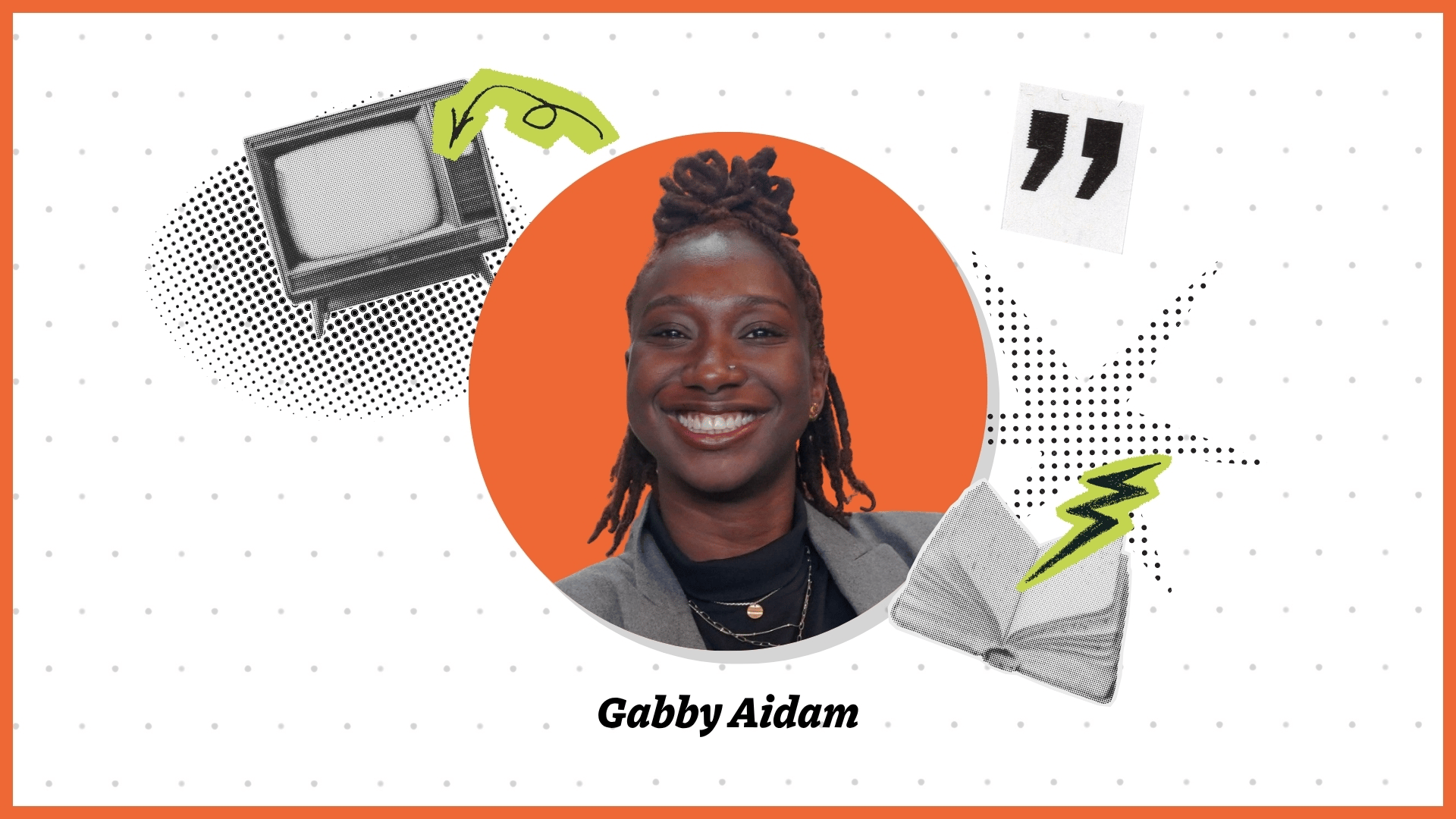
🎬🎨 How Gabby Aidam is Using Animation to Bring Local TV News to Life
Gabby Aidam, a recent Northeastern Game Art & Animation graduate and RLTVN fellow, is helping local TV stations rethink digital storytelling by using animated elements to break down complex topics.
She focuses on visual clarity and playful design, like treating story graphics as tangible objects, to engage younger, digital-first audiences. Her work offers a blueprint for newsrooms looking to evolve beyond the same old visuals and reach new viewers. Read here
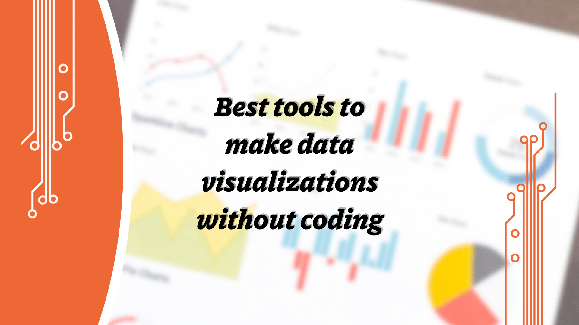
🛠️📊 Best No-Code Tools for Data Visualizations
In this roundup, our very own, Anastasiia Boltkova outlines how journalists can create professional data visuals without coding by using tools like Flourish, Datawrapper, Tableau and Google My Maps.
She explains when each tool works best, whether you’re telling a narrative in slides or need a quick chart for a story, and emphasizes that the right tool depends on the story’s needs more than the visuals. With data increasingly central to journalism, mastering these no-code platforms is becoming essential.
Cool Stuff Corner: What are we reading?
🗳️🔓 How Every House Member Voted to Release Epstein Files
The Washington Post interactive shows the near-unanimous 427-1 vote in the U.S. House of Representatives to force the release of investigative files tied to Jeffrey Epstein.
It includes detailed breakdowns by state and district so readers can see how their representative voted, plus context on the discharge petition that forced the vote — a procedural step rarely used so publicly. The bill’s passage signals a major shift in how congressional transparency is being exercised in high-profile cases.
🌐🚶♀️ What it’s like to walk across Massachusetts
The Pudding project taps into mobile-phone step data to track average walking distances across U.S. cities — revealing that Americans cover less ground on foot than in decades past.
With maps, charts and regional comparisons, the team shows how car dependence, urban design and climate affect our actual mobility in everyday life.
From the Vault 🏛️
🤖📊 The Marshall Project’s Aaron Sankin on AI, Large Data Sets and Contextualizing Data Stories in the Real World
At The Marshall Project, deputy data editor Aaron Sankin walks Storybench through how the newsroom uses massive datasets, public records and AI tools to shape stories about the U.S. criminal-justice system. He highlights the tension between arriving at a story with a hypothesis and the journalistic standard of objectivity, and warns that data without real-world context can mislead. Sankin also outlines “Hack Days” where the team experiments with emerging tools and workflows to push innovation in data journalism.

PHOTO OF THE WEEK 📷
It’s beginning to look a lot like winter, everywhere I go! The leaves are gone, scattered across the sidewalks and crunching underfoot. In New England, 4 p.m. now feels like 6 p.m., with early sunsets and cold winds settling in for the season. Here’s what Roxbury looks like through our lens. [📸: Vivica Dsouza]

That's all we've got for this week! Thanks for reading, and let us know if there's anything you'd like to see in these newsletters or in our coverage at [email protected].
And follow us on Instagram, Twitter (or X, or whatever) and LinkedIn for live updates on stories each week!