- The Bench Brief
- Posts
- 🎧📌 From Family Talks to Public Records
🎧📌 From Family Talks to Public Records
How journalism turns conversations, files and data into stories that resonate
Storybench
January 16, 2026
Hey there, Benchies!
This week’s lineup spans the deeply personal and the deeply documented. We’re featuring a student-led podcast that opens up conversations many people avoid, alongside reporting that relies on thousands of pages of records to clarify what really happened in Uvalde.
Add in interactive storytelling on music and search trends, plus data tools from our archive, and you’ve got a newsletter packed with ideas on how stories — big and small — come together.
Let’s dig in!
Here is our featured content this week:
🎙️👩👧 Inside “Papaya Talk”: Northeastern Student Turns Mother-Daughter Conversations Into a Women’s Health Podcast
“Papaya Talk” began as a women’s health podcast focused on pelvic floor education and evolved into a weekly mother-daughter conversation covering women’s health, daily life and topics young women often hesitate to discuss openly.
Co-host Nadia Herrera-Set and her mother blend professional insight and lived experience in episodes recorded throughout the academic year, aiming to normalize candid discussions about health and adulthood. Read the Q&A

📰📌 Inside the Files: The Reporting That Rewrote Uvalde’s Story
ProPublica and Texas Tribune reporter Zach Despart reflects on his team’s extensive investigation into the 2022 Robb Elementary School shooting in Uvalde, Texas, explaining how deep access to investigative files revealed crucial details about the law enforcement response and timeline.
This interview explores the challenges of reporting amid chaos, the toll of covering traumatic events, and what remains misunderstood about how the tragedy unfolded.

Cool Stuff Corner: What are we reading?
🔍📈 Visualizing Google trends data
Google’s Visualizing Google Trends data project showcases how search behavior can be turned into interactive visualizations that reveal patterns in what people around the world are searching for at different times.
The site includes examples like global search trends, interactive quiz tools and visual essays that highlight interest in topics ranging from pets to daily rhythms, emphasizing how search data can tell stories about collective curiosity.

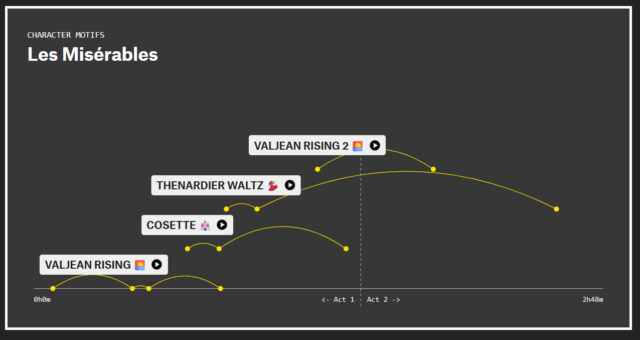
🧠⏱️ How musicals use motifs to tell stories
In Motifs, The Pudding uses interactive visuals to show how recurring musical themes function in stage productions like Hamilton, Wicked and Les Misérables, breaking down how melodies return and evolve throughout a score. By isolating motifs and displaying when and where they appear, the project highlights how composers use repetition and variation to carry emotional meaning and narrative across a performance. Click here
From the Vault 🏛️
🚕📈Exploring Chicago rideshare data in R
Martin Frigaard and Peter Spangler used anonymized ride-hailing data from Chicago, the first U.S. city to release detailed Uber, Lyft and Via trip records, to show how to analyze patterns like ride timing, tipping and trip distances using the R programming language. The tutorial highlights how journalists and data analysts can clean, sample and visualize large transportation datasets to uncover insights about urban mobility.
🎓📊 What’s a college worth to you? These data sources go beyond the rankings.
This round-up will compel you to look past traditional college rankings and use broader data — such as how much schools spend per student, engagement metrics and critical thinking about ROI calculators — to get a fuller picture of higher education value. The article highlights alternative sources that can deepen data-driven reporting on colleges

That's all we've got for this week! Thanks for reading, and let us know if there's anything you'd like to see in these newsletters or in our coverage at [email protected].
And follow us on Instagram, Twitter (or X, or whatever) and LinkedIn for live updates on stories each week!