- The Bench Brief
- Posts
- 📡📊War, words and visual truth in the age of data
📡📊War, words and visual truth in the age of data
Satellite imagery, political rhetoric and design choices show how data and technology shape the stories journalists, and audiences see
Storybench
March 13, 2026
Hey there, Benchies!
This week’s Storybench newsletter explores how technology, language and design influence the way news is produced and understood. From satellite companies restricting war imagery to a data analysis of presidential speeches, our featured stories examine how information is gathered, framed and trusted.
We also highlight tools expanding data storytelling, interactive weather maps and a quick look at how rising costs continue to reshape household budgets.
Let’s dive in!?
Here is our featured content this week:
📡🛰️ Satellite companies restrict journalists’ access to images from the Iran war
Commercial satellite firms are limiting journalists’ access to high-resolution imagery of the ongoing war involving Iran, raising concerns about transparency in conflict reporting. Restrictions on certain images and datasets make it harder for reporters and open-source investigators to independently verify events on the ground.
The shift highlights how privately owned satellite infrastructure now plays a powerful role in shaping what visual evidence from war zones reaches the public. Read more

Video footage appears to show a U.S. Tomahawk missile landing near an elementary school in Minab, Iran on Feb. 28, killing 165 people, including many children. Via Mehr News
🗣️📊 From words to war: A text analysis of Trump’s week in three speeches
This piece by Emily Glick analyzes the language President Donald Trump used across three speeches delivered within five days — from a State of the Union address to wartime announcements. The data shows a sharp rhetorical shift as the country moved toward military action, with vocabulary evolving from domestic themes to language centered on conflict and national strength.
Word frequency analysis illustrates how quickly political messaging can change during a fast-moving crisis.
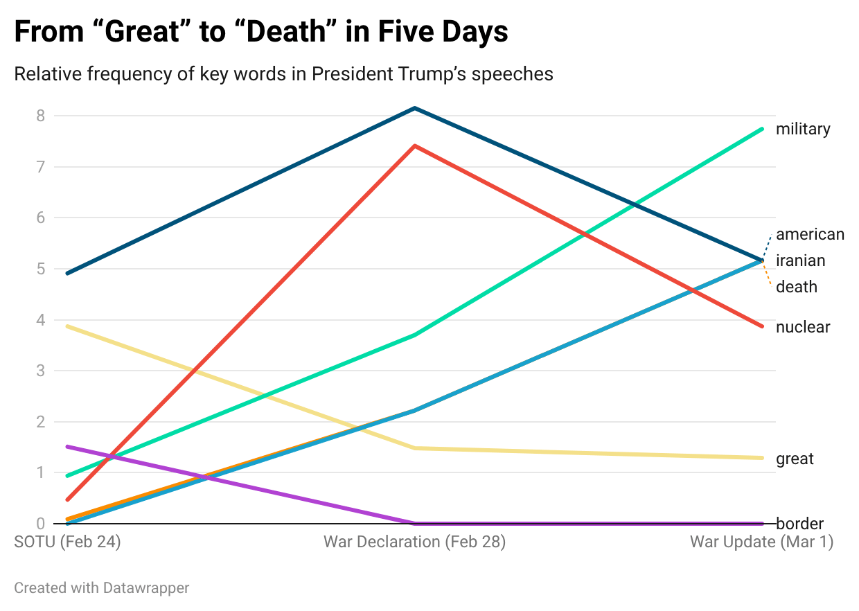
Created using Datawrapper
🎨📈 The Surprising Design Secrets Behind Trust in Data Visualization
Trust in a data story often forms in seconds, shaped by design cues such as typography, color choices and chart style. Researchers and designers say readers subconsciously judge whether a visualization feels credible before engaging with the data itself.
In an era of AI tools and rising skepticism toward information, thoughtful design decisions are increasingly central to how audiences interpret and trust visual journalism.

Cool Stuff Corner: What are we reading?
🌪️🗺️ Extreme Weather Maps: Track the Risks for your Places
The New York Times built interactive maps that allow readers to explore forecasts for extreme weather across the United States. The project visualizes how storms, heat and other climate-driven events may evolve geographically over time.
By combining meteorological data with interactive design, the feature helps readers better understand how weather risks may affect specific regions.

Did you know?💡
The cost of living hasn’t gone back to pre-pandemic levels. Even though inflation has slowed, everyday expenses remain far higher than before the pandemic. In the U.S., it now takes about $119 to buy what $100 could purchase in early 2020, reflecting years of rising prices across essentials such as groceries, housing and utilities.
Interactive graphics from Bloomberg show how household budgets have been reshaped by these increases, and why many families still feel squeezed even as the pace of inflation cools.
From the Vault 🏛️
🧰🔊 These tools will take your data to a new level — or decibel
This roundup highlights creative tools journalists can use to transform data into sound and immersive experiences. From sonification platforms to experimental visualization software, the tools show how data storytelling is expanding beyond charts and maps.
The approach can help audiences perceive patterns in new ways and offers reporters fresh formats for engaging storytelling.

Sonification can make an audience feel and understand data in ways they couldn’t before, as it can come alive off the screen when listened to
That's all we've got for this week! Thanks for reading, and let us know if there's anything you'd like to see in these newsletters or in our coverage at [email protected].
And follow us on Instagram, Twitter (or X, or whatever) and LinkedIn for live updates on stories each week!