- The Bench Brief
- Posts
- 🌍🧠When data gets visual — and actually makes sense
🌍🧠When data gets visual — and actually makes sense
This week: climate storytelling, trade flows, newsroom tools and simple ideas that turn complex data into something you can see
Storybench
March 20, 2026
Hello Benchies!
Not all data stories feel accessible — but the best ones make complexity look simple. Whether it’s tracking climate patterns or visualizing how goods move across borders, storytelling plays a key role in how audiences understand data.
In this week’s picks, we’re looking at how journalists and researchers are turning dense information into visuals that inform, engage and stick with readers
Let’s go!
Here is our featured content this week:
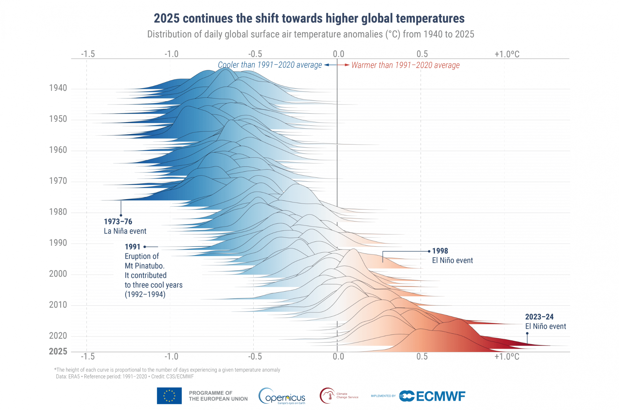
🌍📊 How Copernicus Makes Climate Data Simple and Easy for You to Understand
Our latest interesting piece explores how Copernicus Climate Change service uses satellite-derived data to create interactive, visually rich story maps for broader audiences. These projects translate complex environmental data into accessible narratives for journalists, educators and the public.
Behind much of this work is Dr. Anna Lombardi, a data visualization specialist at the European Centre for Medium-Range Weather Forecasts, which runs Copernicus’ climate monitoring efforts. The approach highlights how structured data can be turned into engaging, easy-to-understand visual stories. Read more
Cool Stuff Corner: What are we reading?
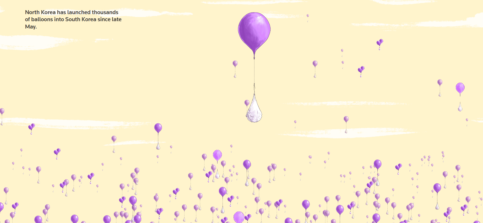
🎈🗺️ North Korea has launched thousands of balloons into South Korea since late May
Balloons carrying trash across borders might sound strange — but they’ve become a real geopolitical signal. This visual tracks where they land, how often they cross and what that looks like on the ground.
A simple idea, mapped in a way that makes the story stick. Look here to see what North Korea’s been up to.
📦🌍 How tariffs are reshaping global trade
Global trade isn’t just about what’s made, it’s about where it moves. This New York Times interactive shows how U.S. tariffs are quietly rerouting Chinese goods across countries, supply chains and production lines. A clear, visual way to see policy reshaping the global economy in real time.
Did you know?💡
Are there times you wake up at 3 a.m. and can’t go back to sleep? Studies have found 1 in 5 adults in the United States and Europe suffer from this kind of insomnia.
If you wake up in the middle of the night, checking your phone or the time can make it harder to fall back asleep by increasing alertness and anxiety. Experts suggest the simple technique of 4-7-8 like controlled breathing or staying still to help the body return to a relaxed state.
From the Vault🏛️
🧹📈 How to clean data with OpenRefine
Dug out from our vault, this tutorial walks through how journalists can clean messy datasets using OpenRefine, a powerful open-source tool. It covers key steps such as sorting, filtering, clustering and fixing inconsistencies in data. The tool allows reporters to identify errors and standardize data before analysis or visualization. Check it out.
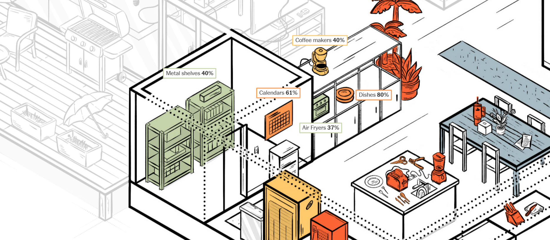
👟📦Step-by-step: Exploring the sneaker lifecycle through data physicalization
This project shows how data can be turned into physical objects to explain the lifecycle of sneakers. It breaks down production, distribution and environmental impact using a tangible, step-by-step storytelling approach. The work demonstrates how physicalization can make complex data more engaging and easier to understand.

XYZ Data Labs and The Footwear Collective held a data physicalization exhibit on Feb. 2 to show the environmental impacts of a sneaker lifecycle. (Photo by Kelly Chan)
That's all we've got for this week! Thanks for reading, and let us know if there's anything you'd like to see in these newsletters or in our coverage at [email protected].
And follow us on Instagram, Twitter (or X, or whatever) and LinkedIn for live updates on stories each week!